Designing a Voice-Guided AI Onboarding for tuNirvana
tuNirvana is a Spanish-language emotional-wellness app. Its onboarding had to do something delicate: introduce a first-time AI experience to emotionally vulnerable users without feeling cold, clinical, or invasive. I designed a 14-screen flow guided by a conversational AI character named Luz — present only at the moments where she added real clarity, confidence, or context. Some proprietary details are omitted under NDA.
Project overview
tuNirvana is a mobile wellness product built around emotional support for Spanish-speaking adults. Before anyone can benefit from a wellness app, they have to get through onboarding — and for this audience, many of whom were meeting a conversational AI for the first time, that first stretch was the riskiest part of the entire experience. If the introduction felt confusing, mechanical, or pushy, users would leave before the product ever had a chance to help them.
My job was to design that introduction as a guided experience rather than a sequence of forms. The flow centered on Luz, a conversational AI character who welcomed users, explained what was happening, and set expectations for each step. Crucially, Luz was not present on every screen. Across the 14-screen onboarding she surfaced at only four carefully chosen moments — enough to orient and reassure without crowding the experience or making the AI feel like it was hovering.
AI made sense here precisely because the content was emotional, not technical. A static tooltip can explain a button; it can't lower someone's guard before they share how they feel. A conversational guide could adapt tone, acknowledge hesitation, and frame sensitive requests with empathy — which is what this product needed at the door.
The challenge
The real problem was never "help the user create an account." That part is solved. The challenge was introducing an emotional AI experience to people who might be anxious, skeptical, or completely new to talking with AI — and doing it without the experience feeling cold on one side or invasive on the other.
That tension showed up in several places at once. Emotionally, the tone had to be warm but not performative. On trust, users were being asked to engage with a wellness product and, eventually, with personal information — so every request had to feel earned, not extracted. On privacy, sensitive permissions and data couldn't be requested with a bare system prompt; they needed context and consent that respected the user's control.
There were practical constraints too. The product supported both voice and text, so every guided moment had to work whether the user was listening or reading, and degrade gracefully if voice failed. Everything lived in natural Spanish, not translated English, which shaped tone, length, and phrasing. And accessibility wasn't a layer added at the end — the audience included people in vulnerable emotional states, so clarity, contrast, focus states, and simple language were requirements from the first screen.
Underneath all of it was a quieter design risk: it would have been easy to over-use the AI. A talking character feels novel, so the temptation is to put it everywhere. But an avatar that narrates every screen stops being a guide and becomes noise. The hard part was deciding when the AI should speak — and, just as often, when it should stay quiet and let the interface do its job.
My role
I led the end-to-end design of the onboarding experience, from the high-level concept down to the wording of individual prompts. That meant owning both the structure of the flow and the behavior of the AI inside it — designing not just what the screens looked like, but how Luz spoke, when she appeared, and how the conversation handed off to the rest of the product.
In practice this spanned UX strategy, conversational and prompt design, tone of voice, the onboarding flow itself, and the visual direction needed to support a voice-and-text experience. I prototyped and tested prompt behavior with GPT-4o to validate that the wording held up in both Spanish and English before it shipped into the flow.
- UX strategy and onboarding flow design
- Conversational UX and AI prompt design
- Tone-of-voice design for the Luz character
- Spanish-first UX writing, validated bilingually
- Voice-and-text interaction design and accessibility
- Visual direction and conversational prototyping (GPT-4o testing)
Design goal
Success was not "the user finished creating an account." A completed account is a metric, not an experience. The goal was for users to come out of onboarding actually understanding what tuNirvana was, trusting the process they'd just gone through, and feeling that the guidance had been genuinely useful rather than decorative.
So I designed toward comprehension and confidence, not just completion. Every guided moment had to earn its place by reducing uncertainty — explaining what was about to happen, why something was being asked, or what the user had just accomplished. If a screen could be understood without Luz, Luz stayed quiet. The measure I held the design to was simple: at the end of onboarding, would the user feel oriented and safe, or merely processed?
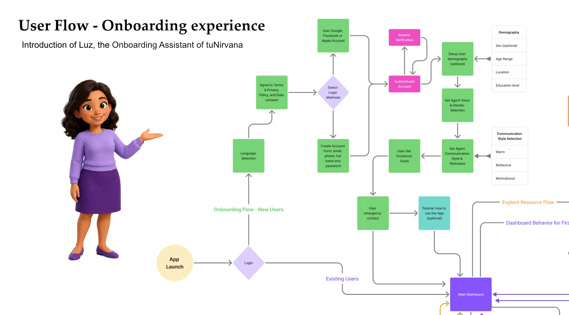
The onboarding flow
The full onboarding spanned 14 screens. Rather than treat them as a flat sequence of forms, I structured them as a journey with a clear emotional arc: welcome the user, get them in safely, explain what matters, set up the experience, and close on a confident note.
The sequence moved through a recognizable set of stages:
- Welcome — Luz introduces herself and frames what onboarding will cover
- Sign-up or access — creating an account or logging in
- Verification — confirming identity or contact details
- Consent & privacy — explaining what's collected and why, with the user in control
- Initial setup — the basics needed for the experience to work
- Interaction preferences — choosing voice, text, or both
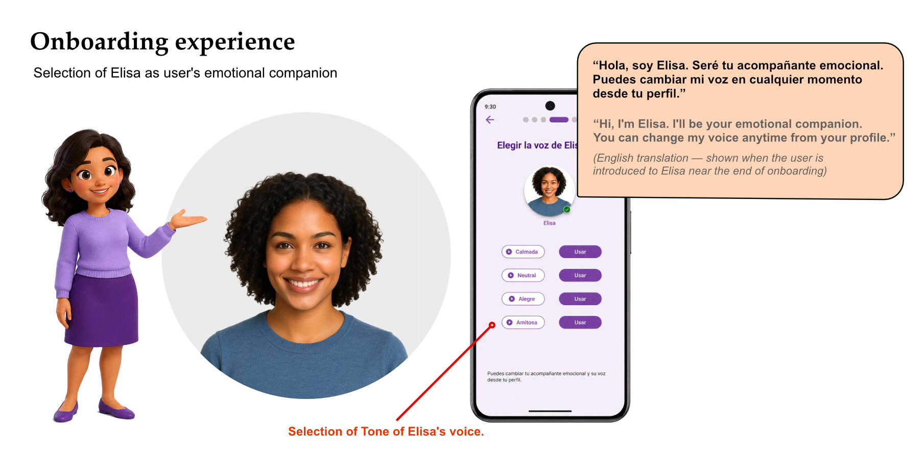
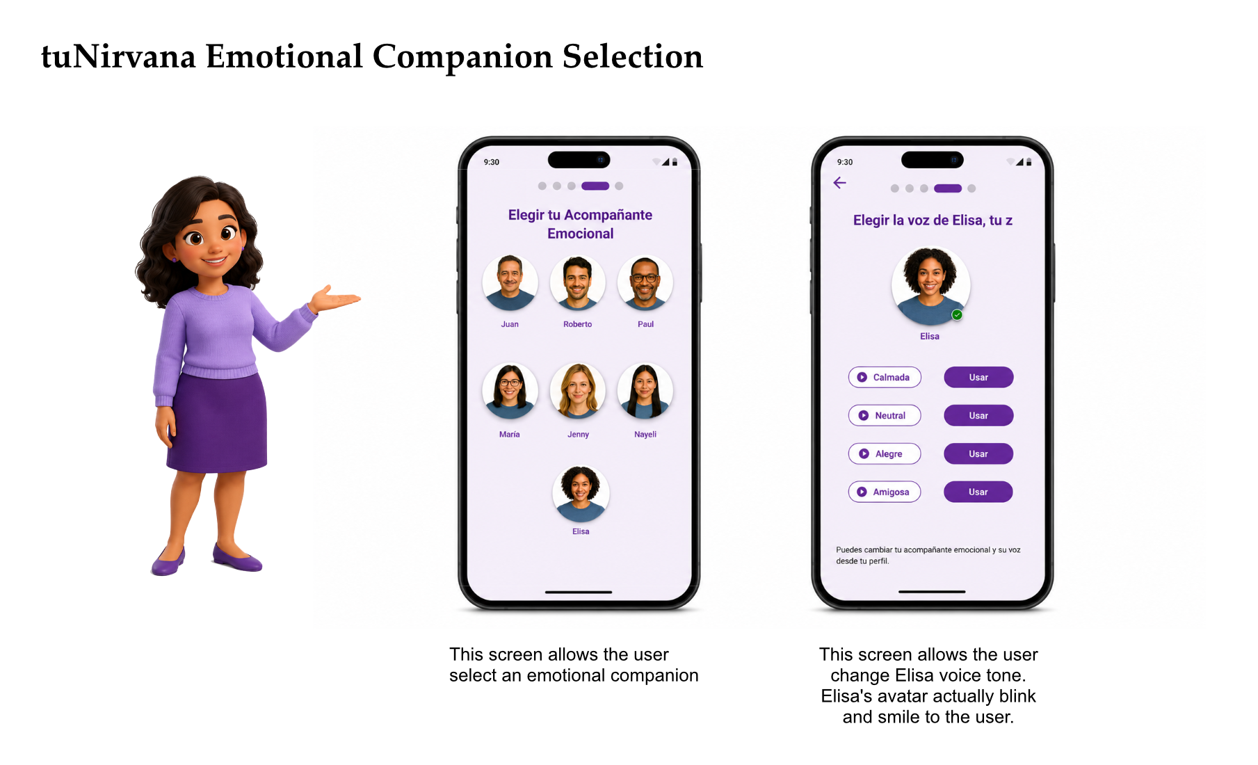
- Introducing the emotional companion — meeting Elisa, who continues inside the product
- Completion — confirming access and closing on an affirming note
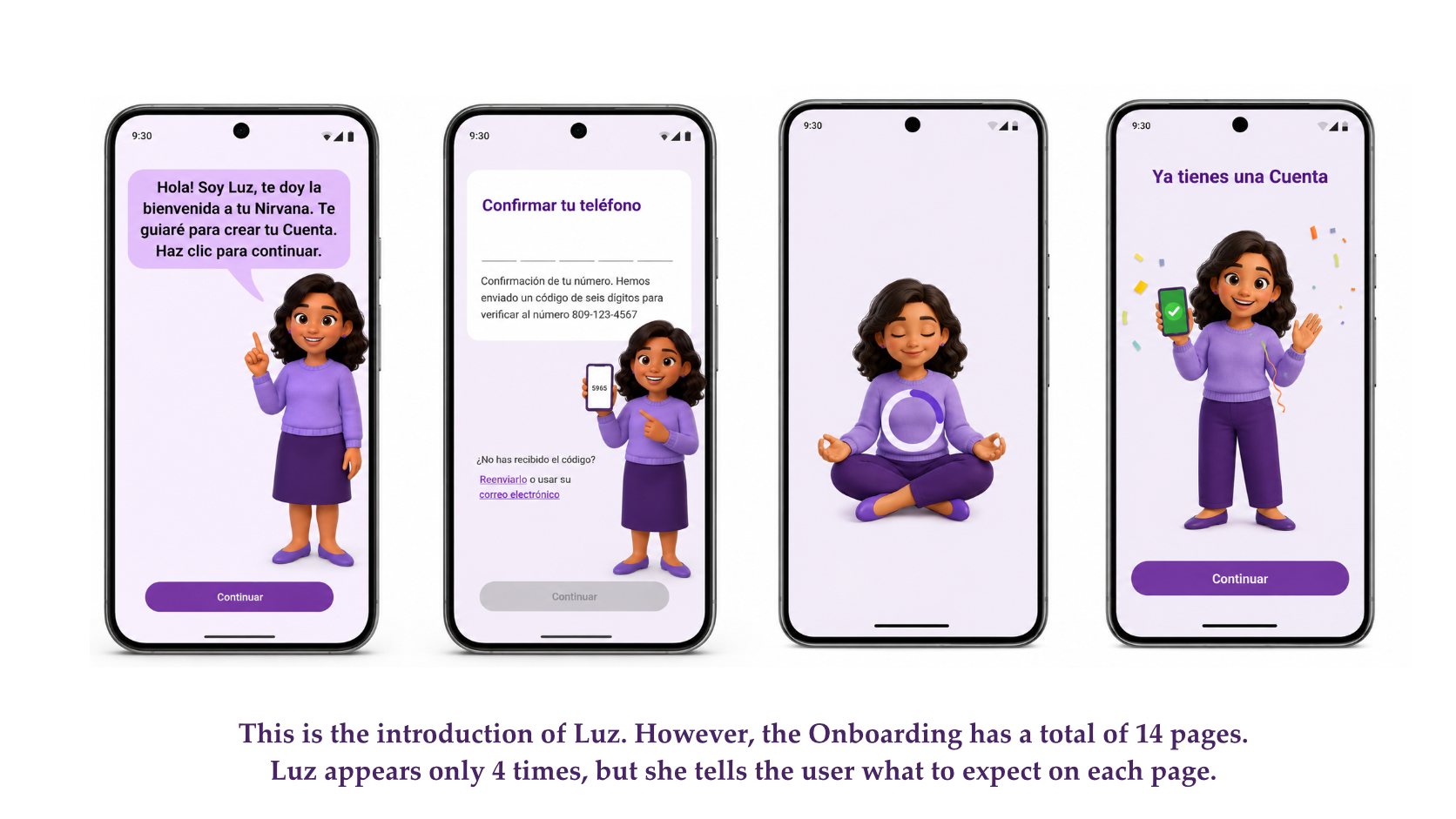
Luz appeared at only four of these moments — the points where a human-sounding voice genuinely lowered uncertainty: the opening welcome, the sensitive consent step, a mid-flow moment of encouragement, and the final confirmation. Everywhere else, standard interface patterns carried the load because they were clearer than a sentence would have been.
That restraint was the point. By mapping the journey first and then deciding where conversation added value, I could keep the AI feeling intentional. Luz showed up when the user most needed reassurance and stepped back when the screen already spoke for itself.
Luz as a guided onboarding character
Luz was designed as a guide, not a mascot. Her purpose was to reduce uncertainty at the moments where a first-time user is most likely to feel lost or hesitant — the opening seconds, a sensitive request, a long stretch of setup, the finish line. At each of those points she explained what was happening and what came next, in a warm, conversational voice that matched the emotional nature of the product.
Just as important was where Luz didn't appear. On screens where a standard control — a toggle, a form field, a clear button — communicated more cleanly than a spoken line, Luz stayed silent. Deciding to limit her presence to four moments across fourteen screens was a deliberate UX decision, not a visual or technical limitation. An ever-present narrator would have slowed the flow, competed with the interface, and quickly worn out its welcome.
This is the part of the project I'd point a hiring manager to: the restraint. It's easy to add a talking avatar everywhere; it's harder to decide that the most respectful thing the AI can do on a given screen is nothing at all. Treating Luz's silence as a feature — not a gap — is what kept the experience feeling guided rather than crowded.
Luz vs. Elisa — two roles, not one
A point worth making clearly, because it's easy to conflate: Luz and Elisa are not the same character, and they don't do the same job.
Luz is the onboarding guide. She exists to get the user into the product — welcoming, explaining, reassuring, and confirming during those first 14 screens. Once onboarding is complete, Luz's job is essentially done.
Elisa is the emotional companion who lives inside the product after onboarding. During setup, the user simply meets Elisa and can adjust her voice; the ongoing relationship — the day-to-day emotional support — belongs to the product experience, not to onboarding. Keeping these roles distinct mattered for clarity: the user should never wonder whether the voice helping them sign up is the same one they'll confide in later.
“Hola, soy Elisa. Seré tu acompañante emocional. Puedes cambiar mi voz en cualquier momento desde tu perfil.” “Hi, I'm Elisa. I'll be your emotional companion. You can change my voice anytime from your profile.” (English translation — shown when the user is introduced to Elisa near the end of onboarding)
Conversational strategy
The language was the product here as much as the screens were. I wrote Luz's voice to be short, warm, and clear — closer to a calm friend explaining something than to an assistant reading a script. That meant cutting anything that sounded clinical or robotic, and resisting the urge to make her over-explain.
Everything was written in natural Spanish first, then validated in English during GPT-4o testing to make sure the tone survived translation. Writing Spanish-first mattered: phrasing, warmth, and rhythm don't carry over cleanly from English, and a translated tone would have felt slightly off to native speakers in exactly the moments where authenticity counted most.
Luz was written to accompany, not command. Prompts suggested and reassured rather than instructed — "I'm here to help you…" instead of "You must now…". The pacing was deliberate too: brief lines at decision points, a little more warmth at emotional ones, and silence where the interface already spoke clearly.
Because the experience supported both voice and text, every line had to read well on screen and sound natural when spoken aloud. That ruled out long sentences, nested clauses, and anything that depended on visual formatting to make sense — copy that worked in the ear as well as the eye.
Behind the prompts
Designing Luz meant designing her prompts — the actual behavior behind each moment she appeared. For each one I worked through the same questions: what is the user feeling here, what's the design problem, how should the prompt behave, and why does that choice matter for the experience. These four moments map to the four times Luz surfaces across the flow.
A · Initial greeting
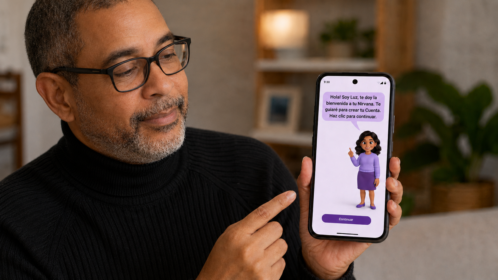
User moment: The very first screen. A first-time AI user, possibly anxious, deciding in seconds whether this app is worth their trust.
Design problem: Opening on a bare "Create your account" wall reads as cold and transactional — the worst possible first impression for an emotional-wellness product.
Prompt behavior: Luz introduces herself, names her role plainly, and frames the task ahead as help rather than a form to fill out.
“¡Hola! Soy Luz. Estoy aquí para ayudarte a crear tu cuenta y explicarte cómo aprovechar esta app para sentirte mejor.” “Hi, I'm Luz. I'm here to help you create your account and show you how to use this app to feel better.” (English translation)
UX reason: The emotional tone set in the first few seconds is the foundation the rest of the flow borrows against. Warmth here buys patience later.
B · Explaining a sensitive step
User moment: The user reaches a consent or privacy step that asks for permissions or personal information.
Design problem: Wellness data is sensitive. A system-style permission prompt with no context feels invasive and can break the trust built on the first screen.
Prompt behavior: Before the request, Luz explains what's being asked, why it helps, and that the user stays in control and can change it later.
“Antes de seguir, quiero explicarte por qué te pedimos esto y cómo lo cuidamos. Tú decides qué compartir, y puedes cambiarlo cuando quieras.” “Before we continue, I want to explain why we're asking for this and how we protect it. You choose what to share, and you can change it whenever you like.” (English translation)
UX reason: Explaining intent before asking turns a privacy prompt from a barrier into a signal of respect — consent becomes a moment of trust rather than friction.
C · Mid-flow encouragement
User moment: Partway through the 14 screens, the user slows down or hesitates before finishing setup.
Design problem: Long flows lose people, and a generic progress bar does nothing to ease the emotional friction of "is this worth it?"
Prompt behavior: Luz offers a short, sincere affirmation tied to the specific milestone the user just reached — never blanket praise, and never more than a line.
“Lo estás haciendo muy bien. Solo falta un paso más.” “You're doing great — just one more step.” (English translation)
UX reason: Milestone-specific encouragement sustains momentum and reinforces autonomy. Users could also skip or return later without pressure, which kept the flow user-driven.
D · Onboarding completion
User moment: The final screen. Access is confirmed and the user has finished setting up.
Design problem: A transactional "Done" wastes the emotional payoff of finishing and ends the relationship on a flat note.
Prompt behavior: Luz confirms access, thanks the user for their trust, and frames the app as a companion for what comes next rather than a task that's been completed.
“¡Perfecto! Tu acceso ha sido confirmado. Gracias por confiar en mí. Estoy feliz de acompañarte en este camino.” “Perfect. Your access has been confirmed. Thank you for trusting me. I'm happy to join you on this journey.” (English translation)
UX reason: Closing on an affirming, human note reinforces the relationship and makes the user more likely to return and engage with the product.
AI behavior rules
To keep Luz consistent — and to keep the AI from overstepping — I defined a small set of behavior rules that governed how and when she acted. These weren't style preferences; they were the guardrails that made the AI feel trustworthy instead of intrusive.
- Guide, don't push — Luz suggests the next step but never blocks or nags. Users move at their own pace.
- Confirm before advancing — important or irreversible steps are restated and confirmed, so the user always knows what just happened.
- Explain before asking for sensitive information — every request for personal or emotional data is preceded by a short reason and a note about control.
- Offer voice or text — every guided moment works equally well spoken or read; neither mode is ever required.
- Keep a supportive, non-clinical tone — Luz sounds like a caring guide, not a therapist or a medical device, unless the context genuinely calls for more.
- Stay brief by default — responses are short; depth is available on request, never forced on the user.
- Let the interface lead when it's clearer — when a standard control communicates better than a sentence, the AI steps back and says nothing.
- Never trap the user — skipping, pausing, and returning later are always allowed, without penalty or guilt-tripping copy.
Accessibility & trust
Accessibility wasn't a compliance checklist bolted on at the end — it was central to the brief, because the audience included people who might be reaching for a wellness app in a vulnerable moment. For them, friction isn't just inconvenient; it can be the reason they give up.
So the flow was built for clarity first. Copy stayed simple and concrete, contrast met WCAG AA/AAA, buttons and interactive elements were visible and obvious, and keyboard focus states were clear throughout. Screen-reader support was built in with aria-label and aria-live so that Luz's guidance and status changes were announced, not lost.
Because the experience was both spoken and read, voice came with a safety net: a voice preview let users hear Luz before committing, and a text fallback meant the flow never broke if voice failed or wasn't wanted. No one was forced into a mode that didn't work for them or their environment.
Trust and accessibility were two sides of the same goal. Privacy was explained in context, at the moment it mattered, in plain language — not buried in a policy. The combined effect was an onboarding that felt safe to move through: clear enough to follow, gentle enough not to pressure, and honest enough to earn the user's confidence.
Visual design & system
To support a prompt-driven, voice-and-text experience, I built a modular, responsive design system for AI-first interactions. Components — dialog cards, input fields, voice/text toggles, and configuration panels — were designed for clarity, accessibility, and cross-language support, so the same patterns could carry both a spoken journey and a read one.
The system kept tone and interaction patterns consistent across mobile screens. A user adjusting how the AI behaves — its voice, its mode, its presence — saw the same calm, legible language whether they were configuring settings or being guided by Luz. That consistency is part of what let the AI fade into the background when it needed to: the interface always felt like one coherent product, not a chatbot bolted onto a form.
Outcome
The result was an onboarding that felt human and guided rather than mechanical. Instead of a wall of forms, first-time users moved through a clear, paced journey where the AI explained the process at the moments it mattered and stayed out of the way everywhere else.
Just as importantly, the AI helped explain the experience without replacing the clarity of the interface. Luz lowered uncertainty at the welcome, the consent step, the mid-flow lull, and the finish — while standard controls did the work on the screens where they were simply clearer. The two layers reinforced each other instead of competing.
The project also produced a reusable foundation: a set of conversational patterns, behavior rules, and components for designing AI guidance that is warm without being clingy, and present without being constant. That framework is the part most likely to outlive this single flow.
What I learned
The biggest lesson was that AI UX is not about putting a chatbot on everything. The novelty of a talking character makes it tempting to let the AI narrate the whole experience, but that's usually the wrong instinct. The real design work is deciding when the AI should speak, when it should stay quiet, and when a plain interface control is simply the better answer.
I also learned that an avatar is a double-edged tool. Used at the right moments, Luz built trust and made a daunting flow feel manageable. Used everywhere, she would have done the opposite — slowing people down and turning reassurance into noise. Restraint, not presence, is what made the character work.
Finally, conversational design needs the same rigor as visual design: rules, tone, limits, and context. In an emotional product especially, the AI has to feel useful, not invasive — and that feeling doesn't happen by accident. It comes from writing prompts as carefully as you draw screens, and from being willing to take the AI out of the room when the user is better off without it.